Header
logo
CONTACT US
logo
SERVICE PORTFOLIO RESOURCES ABOUT CONTACT US
hero-section-image

RESOURCES

Paper Material and Weights Guide for Printing

Paper Material and Weights Guide for Printing

There are multiple paper material choices to choose from for different usage that will effect...
There are multiple paper material choices to choose from for different usage that will effect the final product quality regarding on the thickness, weight, quality and texture. Choosing the right material will bring out the best quality for each printing purpose.

Here is a breakdown of common paper materials and their best use cases.
1. Bond Paper
Commonly used for office document. Lightweight with smooth texture for large volume text printing in black and white.
2. Matte Paper
Muted and soft surface that refracts light and reduce glare. Suitable for readable purpose.
3. Glossy Paper
The shiny and reflective surface provides sharp and vivid colours, suitable for high-quality image printing.
4. Recycled Paper
Made with old paper waste that is environment friendly. It provides different textures and finishes.

Paper weight is measured in grams per square meter (gsm), the higher the gsm, the thicker and heavier the paper.
90gsm: For uncoated paper without chemical treatments. Ideal for large quantity printing for text that is more affordable.
130gsm: Best used for matte and gloss paper because it ages well for poster and brochure printing.
170gsm: For thin paperboard purpose to print catalogues, certificate and poster.
350gsm: Suitable for business card, cover or invitation card.
380gsm: The heaviest paper types for folders, packaging, book cover and product tag.

What is Colour Matching

What is Colour Matching

Having the correct colour in the design and printing output is an important part to...
Having the correct colour in the design and printing output is an important part to include during the printing process. It is a challenging part to be involved to ensure the quality of the colour when printed out on different material for the most accurate result with the original design.

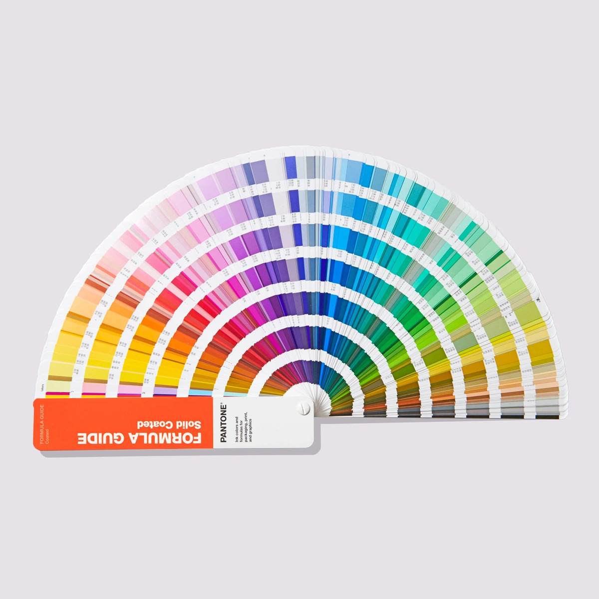
Colour matching is the process to find and approve the colour to match on-screen and off-screen, ensuring the colour seen is same. Pantone Matching System (PMS) is standardized and used globally for colour matching purpose. The PMS colour that people see have been matched to CMYK for accuracy.

CMYK means cyan, magenta, yellow and black that is commonly used in office or home printer. During the design process, designer will mostly choose the colour based on CMYK standard.

Different aspect will affects the accuracy of colour matching. The screen used to view the design, no matter is from desktop, laptop or mobile will have many settings that brings out the colour slightly different. Material used for printing also cause colour difference due to the inconsistent of texture and thickness. Environment lighting from outdoor to indoor brings out the colour differently.

To get an accurate colour match, we need to calibrate the viewing screen based on specific settings for Windows and Mac computer. Photoshop provides soft-proofing function to get an somewhat accurate idea on the printed version design. Using a colour library is the best and easiest way to opt for that save time and effort to focus on other things.
The Art of Typography Pairing

The Art of Typography Pairing

Typography is more than just choosing fonts— it’s about creating harmony, contrast, and readability in...
Typography is more than just choosing fonts— it’s about creating harmony, contrast, and readability in design. Pairing the right typefaces enhances visual appeal and strengthens the message being conveyed.

Before pairing fonts, it’s important to understand the basic categories:

Serif: Traditional and elegant (e.g., Times New Roman, Garamond)
Sans-serif: Clean and modern (e.g., Helvetica, Futura)
Script: Decorative and flowing (e.g., Brush Script, Pacifico)
Display: Bold and attention-grabbing (e.g., Impact, Lobster)

The principles of typography pairing can be categorized as below:
1. Contrast for Visual Interest
Pairing a serif with a sans-serif font creates a balanced yet dynamic look. For example, Playfair Display with Montserrat.
2. Hierarchy for Readability
Use different weights and sizes to guide the reader’s eye. The headlines should be bold and distinct from body text.
3. Consistency for Brand Identity
Stick to two or three fonts to maintain a professional and cohesive look.
4. Mood and Purpose Alignment
Fonts should match the tone of the design—formal, playful, or minimalistic.

By mastering typography pairing, designers can create visually compelling and legible compositions that leave a lasting impression.
Most Common Design Tools in Industry

Most Common Design Tools in Industry

Graphic design software is used to create, edit and refine graphic design for different media....
Graphic design software is used to create, edit and refine graphic design for different media. There are many software available in the industry that provide different functions and tools for specific usage.

Most commonly used software for graphic arts are Photoshop, Illustrator and InDesign.

Photoshop is a graphic editor software best for image editing. This software provides image manipulation, compositing, image editing and analysis also mockup usage.

With Illustrator, it can create everything related with vector illustration, logo, graphic and font. It focus more on vector art that allows to resize and rescale the design without losing image clarity.

InDesign is a page layout focused software for designers in publishing. This software allows for layering out magazine and newspaper by organize text, create layout format and insert image placeholder.

While these three are the industry standards, designers also explore alternative tools depending on project needs. Choosing the right tool depends on the type of design work and personal workflow preferences.
Graphic Design Trends in 2025

Graphic Design Trends in 2025

The world of graphic design is evolving rapidly in 2025, blending technology, bold aesthetics, and...
The world of graphic design is evolving rapidly in 2025, blending technology, bold aesthetics, and nostalgic typography. Here are three major trends shaping the industry:

1. AI-Enhanced Design
Artificial intelligence is transforming workflows by generating layouts, typography, and design elements faster. Designers use AI to automate repetitive tasks, create personalized branding and enhance creativity. However, human designers remain essential, as AI tools serve as assistants rather than replacements.

2. Bold Minimalism
Minimalism is shifting towards high-impact visuals with strong typography and color contrasts. This trend features thick, oversized fonts for attention-grabbing headlines with Vibrant colour blocking. It has simple yet striking layouts.

3. Retro Serif Revival
Serif fonts are making a comeback, merging classic elegance with a modern twist. Expecting a bold, high-contrast serif typefaces inspired by 90s editorial design and mixing of serif and sans-serif pairings.

2025’s design trends blend AI-driven creativity, bold aesthetics, and nostalgic typography. Whether embracing AI tools, experimenting with bold minimalism, or reviving retro serif fonts, designers are finding new ways to make a lasting impact.
Trends for Print and Packaging

Trends for Print and Packaging

As print and packaging evolve in 2025, sustainability, smart cutout designs, and textured printing are...
As print and packaging evolve in 2025, sustainability, smart cutout designs, and textured printing are key trends. Brands are using eco-friendly materials, interactive shapes, and tactile finishes to create both functional and eye-catching packaging.

1. Sustainable & Eco-Friendly Packaging
Sustainability becomes top priority, seeking low-impact materials and waste-reducing alternatives. Many companies are shifting toward recycled and biodegradable materials. Minimalist and reusable packaging design encourage repurposing and reduce waste.

2. Clever Cutout & Die-Cut Packaging
Creative cutout design add function and visual interest into packaging. It allows cutout windows to reveal product details. Experiment with foldable and pop-up structures also reduce material. These design choices improve customer engagement and brand storytelling.

3. Textured & Tactile Printing
Print and packaging are becoming more interactive through the use of texture. Brands are using embossing and debossing to add depth and dimension. Raised UV printing create a tangible, sensory experience. Packaging becomes more premium and engaging, helping brands stand out in a competitive market.

The future of print and packaging focuses on eco-conscious choices, innovative cutout designs and multi-sensory textures. These trends not only elevate branding also evolving consumer expectations and industry sustainability goals.
Footer Back To Top